All blog posts ……..Start each work week with the latest issue. Scroll down to subscribe!
Training the right things the right way—but learners still aren’t doing them? This might be why.
Dear friends:: This article is posting one day early, in honor of tomorrow’s holiday. Next week’s article will post on Monday as usual.
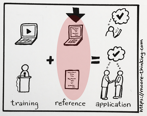
Often, the training we deliver must be supported in the field by reference materials.
That’s the case because:
- Training is great for explaining and showing how to perform skills and tasks, and for assessing learners’ knowledge of how to perform skills/tasks and learners’ actual ability to perform them.
- Unfortunately, training is lousy at driving long-term recall of each fact, concept, and step associated with a complex, nuanced, multi-step skill or process.
Add in the fact that many trainings don’t provide exhaustive skills performance (relying instead on multiple choice questions or a small handful of scenarios) and it’s easy to see that training alone is rarely sufficient to drive the application of non-trivial skills in the field.
After successfully completing training, learners can be expected to know why and, in general, how to do something; but no matter how good their memories are, they need usable, accurate reference documentation—whether that takes the form of a job aid or, as is most often the case, access to process docs stored in a content management system—to identify all the minutiae involved in actually doing it correctly.
Top 9 strategies for creating effective reference documentation
You may notice two things about the following list:
- It takes a scaled-up view (multimedia documentation housed in a content management system or other database vs. a single job aid). If it’s help putting together an effective job aid that you’re looking for, check out Top 10 tips for creating effective job aids.
- All but one of the suggestions relate to content presentation vs. writing tips. That’s because writing well requires a lot more than a short list of suggestions and, for the purposes of this article, is a given. (Read on for suggestions if good on-staff writing skills aren’t a given at your organization.) And next to poorly written material, poor presentation and layout of otherwise well-written material is the most common point of failure.
Consistent application of the principles below will make all the difference in driving the long-term success, otherwise known as return on investment (ROI), of your project.
1. Don’t settle for anything less than clear, concise, complete, well-written documentation.
Avoid being penny-wise and pound-foolish. There’s no point in providing learners with low-quality documentation. They’ll waste time trying to figure it out, guess and apply it incorrectly (and unevenly), and eventually ignore it and keep their own documentation—all bazillion of them, which means you now have multiple copies of “truth” in multiple stages of accuracy and currency floating around your organization.
Presumably, trainings and documentation support mission-critical initiatives such as customer service and compliance regulation. What sense does it make to train employees to “follow process,” then provide them inaccurate or confusingly written process to follow?
High-quality writing pays for itself many times over in productivity. If you don’t have a professional writer on staff, bring on a contractor until you can build effective technical writing skills in-house. If budget is a concern, check out one of the many options available online, such as Google’s free technical writing course or the always-useful Purdue Online Writing Lab, which covers the very basics of writing thoroughly.
2. Include a table of contents (TOC).
For digital reference documentation, provide access to a table of contents at the top of the screen; for print, present the TOC at the beginning of the document. Doing so doesn’t just enable learners to locate the information they need quickly; it also implicitly reinforces the context of, and provides meaningful alternatives for, that information. In other words, the very act of looking at a TOC helps learners identify whether they’re looking up the right thing and, if not, gives them suggestions for what to look up instead.
3. Don’t rely on search.
If you’re going to offer search capability, offer it in addition to (not instead of) a table of contents. That’s because search is only useful if:
- Learners know exactly what they’re trying to look up, what it’s called, and how to spell it; for example, a specific document title, process ID, and so on.
- The searchable content is relatively well-defined, relatively granular, and architected effectively (e.g., content titles and tags are accurate, meaningful, and consistent). Achieving all this takes formal training and expertise, especially for large content management systems; but if budget-conscious management doesn’t understand this, they may task small teams of untrained writers to do it (with predictably bad results).
QUICK TIP: If we find ourselves needing to train learners over and over again on how to use a search function, we can be sure our content management system and/or content are architected ineffectively.
The problem is that learners often do NOT know the specific term they’re trying to look up. Or they might not be looking for a specific term at all, but a category of information, concept, or fact that the content management system folks didn’t expose (or exposed in an unexpected way). In such cases, search fails. A table of contents, on the other hand, fills the gap. A TOC supports learners by showing terms in the context of broader categories and concepts, allowing learners to course-correct quickly and drill down to the specific information the need (but didn’t know precisely how to express).
4. Keep your documentation layout as stable as possible.
Frequently redesigning the table of contents or its appearance makes finding things difficult for learners. Spend time up front designing a well-organized, expandable TOC and stick to it.
5. Prefer text over tiles.
Text is compact and allows us to communicate hierarchical dependencies instantly. UX-busting tiles, however—which have inexplicably become trendy again after a couple of decades of well-earned disuse—take up valuable screen real estate for no good reason. (Sorry, Microsoft SharePoint, but that’s probably the main reason so many dislike you.) Tiles force learners to scroll and also prevent the hierarchical presentation of information, which makes searching for specific information extremely inefficient.
6. Label links correctly.
Use specific, clear, accurate labels chosen with your audience in mind. Make labels concise, but balance conciseness with enough description to ensure learners know exactly what to expect before they click.
7. Label links consistently.
Use the same text label to denote the same resource every single time. For example, don’t associate three links with three slightly different labels (such as N/NG, Nielsen Norman Group, and Usability Experts) to the same link target (the Nielsen Norman Group website).
8. Incorporate images and color both meaningfully and consistently.
Learners use images and blocks of color to navigate quickly. Using the same image to denote two or more different resources breaks that image’s navigational usefulness and turns it from a visual guidepost to a distraction. The same thing happens when we present blocks of color arbitrarily or haphazardly.
9. Present elements in one place only.
Provide exactly one link to each resource (e.g., a single link to each document, web page, video, provided.) It can seem as though offering multiple links to the same, or to slightly different versions of the same, resource would make locating information easier for learners. But the opposite is true.
Imagine if one entry appeared many times in a dictionary, each with a slightly different definition! We wouldn’t be able to go straight to that entry reliably. Instead, we’d have to try to recall all the different places in the dictionary that entry appeared; try to recall which of the different entries contain the specifics we’re trying to locate; and then spin our mental wheels trying to recall where to find the link to that entry. That’s an awful lot of cognitive overload that could have be prevented, and it’s exactly what we do to learners when we offer multiple links to a single (or slightly different versions of a single) resource.
The bottom line (TLDR)
Quality reference documentation combines well-written content with effective layout and is key to learners’ ability to apply non-trivial, multi-step skills to real-world situations.
So when we’re struggling to get to Level 3 on Kirkpatrick’s Levels of Training Evaluation, we probably have to look no further than poor-quality—or absent—reference documentation.
What’s YOUR take?
Do you have a different point of view? Something to add? A request for an article on a different topic? Please considering sharing your thoughts, questions, or suggestions for future blog articles in the comment box below.

Leave a comment