All blog posts ……..Be sure to scroll down to subscribe!
E-learning UX do’s and don’ts
Many of us are used to thinking of UX, or the user experience, as relating only to website design. But UX is relevant to all digital user experience—and that means it applies to e-learning design, too. And just as UX can make or break a retail site’s ability to drive sales, UX can make or break an e-learning’s ability to drive meaningful learning outcomes.
What does “UX” mean?
To define UX, we first need to define UI.
UI, or user interface, refers to everything a software user sees or hears when attempting to use the software: text, images, interactive controls, layout, white space, colors, images, and sounds. UI answers these questions:
- Is the interface visually appealing, or crowded and chaotic?
- Are the text labels presented easy to read, or cryptic?
- Do the shape and placement of interactive controls (such as buttons and links) align with conventions, or do they defy conventions and so confuse users?
- Can learners get the information they need easily, or must they scroll, read, and re-read?
- Can learners determine quickly where to click to complete the task they want to complete, or must they hunt and guess?
UX, or user experience, encompasses UI but also includes the way the user interface responds to user actions such as mouse movement, keystrokes, clicking, double-clicking, right-clicking, and typing. UX answers these questions:
- Does the interface respond to user interactions in conventional, expected ways or does it confuse and frustrate learners?
- Are informational and error messages both easy for users to understand and actionable? Or do they confuse learners, alarm them, or even stop them in their tracks?
- Can learners easily complete each step of the multi-step action they want to complete, or must they struggle and ask for assistance?
As you can imagine, there’s overlap between UI and UX. For example, text labels and layout affect whether and how users interact with an interface–and also set user expectations around those interactions. So many people use the term “UX” to mean both UI and UX.
And also as you can probably imagine, UX can make or break an audience’s experience. When executed poorly, UX can frustrate and confuse learners; when executed well, UX not only “gets out of the way” so learners can learn more efficiently, but also contributes to how learners make meaning and drives recall independently of content.
To optimize our learners’ experience, we need to apply the following UX do’s and don’ts to all the e-learning materials we create.
Technically speaking, LX, which is short for learning experience, refers to UX/UI in the context of e-learning. But because the term LX hasn’t picked up a lot of traction in the field—and because there’s not a lot of difference between LX and UX for other differentiated audiences—this article uses the more commonly known term UX instead.
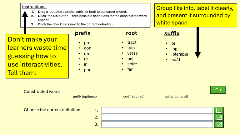
1. DO ensure all onscreen text is accurate, unambiguous, and high-contrast.
Black text on a white background is necessary for long stretches of text (there’s a reason this is the gold standard for print; it enables concentration without distraction far better than any other combination). We can get away with wilder colors (e.g., dark navy on light yellow) for shorter blocks of onscreen text, although there’s often not a reason to do so. Choose a sans-serif font for online text and a serif font for printables.
2. DO use color meaningfully.
Stick to an aesthetically pleasing palette of as few colors as possible. Be aware that audiences respond to color over text, so items that appear in the same color will be perceived as being similar in some way, even if that similarity contradicts the items’ text labels.
3. DO follow navigational conventions consistently.
- UI. Use standard navigation button labeling (“start,” “exit,” “next,” “prev”), link text conventions (ensure link text clearly describes what the learner can expect to find if s/he decides to click) and video controls (play, pause, and stop button icons).
- UX. Also follow standard navigational conventions around how your interface responds to audience interaction. For example, learners expect that clicking a text field allows them to enter text, clicking a house icon takes them to a home page, and clicking the “x” that appears in the upper right corner of a window dismisses that window. Follow these conventions. No learner should ever be surprised by unexpected behavior.
4. DO include an intro and an outro on all interactivities and videos.
- Intro. An introduction that includes a descriptive title and subtitle enables learners to surf away if the topic isn’t what they expected, and helps to prepare learners mentally (by activating prior knowledge) if they do choose to complete the e-learning. Adding a logo or background music to the intro helps to brand the experience, which can be useful if we intend to produce multiple e-learnings associated with a given topic, department, or company.
- Outro. The outro should be identical to the intro, with the addition of a clearly stated “Thanks for completing” message. Outros remind learners of the title they just completed and reassure learners that they have, in fact, officially completed the interactivity or video. (When e-learnings just stop, learners may assume there was a technical issue and waste time contacting their IT department.)
5. DON’T use background music.
Background music decreases’ learners’ ability to concentrate on, making meaning of, and recall information, whether or not they like the music. If you must use background music, use it for intros and outros only.
6. DO use callouts.
Callouts call learners’ attention to specific onscreen content that they would otherwise struggle to locate or miss altogether. For example, if a map of the U.S. appears onscreen while voiceover narration describes Pennsylvania, call out the state of Pennsylvania on the map.
7. DO include an overview.
The overview at the beginning of an e-learning should present a brief description of what the e-learning covers (e.g., “tell ’em what you’re going to tell ’em”), along with any special instructions or requirements, expected completion time, how to navigate the experience, and whether or not an assessment is included. An overview that proactively answers learners’ logistical questions enables learners to focus on content, which helps optimize learning outcomes.
8. DO include a recap.
The recap should list the key takeaways presented in the e-learning; in other words, “tell ’em what you told ’em.” A good recap clarifies important points for learners, reinforces them, and helps drive recall.
9. DO provide audiences with complete navigational control.
This typically means providing:
- A clickable table of contents for e-learnings longer than 2 or 3 minutes;
- Clearly defined, conventionally labeled, and consistently positioned next, back (or prev), exit, and home buttons; and
- Seek bars for video clips.
10. DO telegraph the absence of voiceover narration (for e-learnings that don’t include narration).
Because many audiences expect audio, if you’re not using it (because, for example, you’re relying on onscreen text callouts to support learners who for whatever reasons can’t be assumed to have working audio), display a circle-slash symbol accompanied by a “No audio” message at the beginning of the e-learning. Without it, many learners will waste time fiddling with their speakers and sound settings or even contacting their IT department.
11. DO synchronize the appearance of onscreen content with voiceover narration.
Tweak onscreen content until it matches voiceover narration precisely. Doing so drives learner comprehension; failing to do so impedes learner comprehension.
12. DO present all text at once if you’re not using voiceover.
Presenting all text on a screen or digital document at once supports all readers, whether they struggle to read or are expert readers. It also telegraphs instantly that the page is finished loading, which gives audiences complete control to take a screenshot, move forward, move back, or to stay, read, and re-read.
13. DON’T use voiceover narration to read onscreen text word-for-word.
Instead, limit onscreen text to key take-aways and focus instead on presenting images onscreen that exemplify the concepts described by voiceover narration, synchronizing the appearance of those images with voiceover narration. If you’re determined to provide a read-aloud option, allow learners control whether or not to use it.
14. DO orient learners at all times with respect to where they are in the e-learning.
Seek bars are the convention for videos; running headers or footers such as “Slide 2 of 10,” “% complete,” and icons depicting the number of “lives” a learner has left work well for interactivities.
The bottom line (TLDR)
Any e-learning interface that doesn’t follow conventions or that behaves in unexpected ways:
- Communicates poor quality
- Confuses learners
- Wastes learners’ time
- Interferes with learners’ ability to focus on content
- Makes learning difficult or even impossible
- “Trains” learners to dread having to complete future e-learning
Apply the UX do’s and don’ts listed in this article to help minimize these issues in your next set of instructional materials.
What’s YOUR take?
What UX strategies would you add to this list? Please considering sharing your experiences in the comment box below.
One response to “E-learning UX do’s and don’ts”
-
Excellent article! I just came across your blog and am very impressed. Thanks for sharing your knowledge!
LikeLike

Leave a comment