
In generations past, U.S. schools taught visual competencies along with reading and writing. Now? Not so much… at least, it can seem that way sometimes.
Visual competencies include:
- The ability to communicate physical information such as shape, mass, proximity, and texture through simple sketches or illustrations;
- The ability to communicate non-physical visual experiences such as processes represented by icons, pictures, and arrows; and
- The ability to communicate numerical data through the construction of tables, charts, and graphs (what some refer to these days as infographics).
These competencies are important, because as spectacular as the ability to write well is (and the ability to write well is indeed spectacular!), writing excels at conveying conceptual information. The instant we try to use words to describe a physical object or living creature (such as a fishing pole or a hamster), a process (such as respiration), a visual experience (such as how to navigate a website), or statistical data (such as the numerical trends driving third quarter business results), words begin to fail. In these situations, words can do the job – but nine times out of ten, visuals can do a better job and do it faster. But not just any visual will do!
Third-party images and infographic generators are great, but only if we know beforehand what we want the visuals to communicate.
If you, like many of us, have a few gaps in your visual competency toolbelt, this short article can help by explaining the instructional value of photographs vs. illustrations vs. infographics.
Why use PHOTOGRAPHS?
Photography has only been around for a few generations; but in that time, it’s become a visual staple. Many IDs have access to professionally photographed print and digital materials in addition to inexpensive hardware and software they (or their SMEs) can use to take their own photographs. In instructional settings, photographs can help:
- To communicate real-life depictions of people, creatures, places, and objects. Showing real-life depictions allows audiences to see what photographed subjects would look like from a single angle if learners encountered them themselves.
- To drive empathy. Audiences tend to respond to sad situations depicted “realistically” (photographically) more strongly than those depicted through other visual means. Charity and volunteer groups take advantage of this beneficial aspect of photography when they show photographs of people, animals, and places that clearly need help. In an instructional setting, photographs can be used to help learners understand and empathize with individuals (think picture-in-picture photo of a virtual instructor) and groups (such as an organizational chart that includes photos in a training setting, or historical photos for a high school history class).
- To drive audiences to self-identify; in other words, to help learners picture themselves in photographs. Advertisers make use of this beneficial aspect of photography when they show photographs of smiling models enthusiastically brushing their teeth with the advertiser’s toothpaste, enjoying the advertiser’s hamburger, and so on. Audiences want to be like the model in the advertisement (having such clean teeth! enjoying such a good meal! having such fun!) and are often moved to take action accordingly. Depicting photos of individuals that learners can identify with successfully performing a skill or task can communicate not just content, but motivate learners, too.
Why use ILLUSTRATIONS?
Illustrations for instructional purposes refers not just to professionally published illustrations, but to back-of-the-napkin jottings, whiteboard drawings, AI-generated sketches, and even icons added to a slide presentation gussied up with text labels, arrows, and symbols. Instructional illustrations allow us:
- To communicate theoretical (non-photographable) depictions of people, creatures, places, and objects. Subjects in this category include extinct creatures and objects too small, too large, or too difficult to photograph easily (such as tardigrades, solar systems, or sea bottom-dwelling creatures, respectively).
- To communicate process over time. Illustration makes explaining processes such as the water cycle, the ignition process in cars, or the nervous system in humans–all processes that are too complex to be photographed–not just possible, but easily graspable.
- To offer a simplified alternative to photographs. Sometimes, real-life photographs include distracting backgrounds or shadows; or they leave out something we wanted to show; or they include far more than we want our learners to focus on right now. Illustrations allow us to strip away complexity and extraneous material so that we can depict only those portions of our subject that are relevant to our learning objectives, and to correct photographic “truth” to communicate statistical “truth.” For example, a photograph of a flower may show a petal anomaly. But as an illustrator, you have complete control: you can correct that anomaly to show the most common example of petal shape and color for this flower.
Why use INFOGRAPHICS?
Charts, graphs, and tables can communicate complex information extremely economically, but they aren’t interchangeable. Each is designed to support a specific communication goal, and we need to have that goal firmly in mind before we start considering options so that we can identify the best fit.
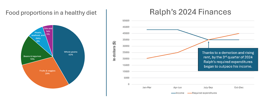
- pie chart – communicates percentages of a whole
- bar chart – communicates differences among categories
- line chart – communicates change in one or more categories over time
- exploded diagram – communicates how a physical object is put together; shows all the pieces, even the inside pieces that would be hidden in a photograph of the object
- Venn diagram – communicates similarities and dissimilarities between two categories (works with three categories, but works best with just two)
- flow chart – communicates the steps in a process
- decision tree – from a beginning state, shows a series of decisions; criteria on which those decisions should be based; and outcomes of each decision flow or “branch”
- map – communicates details about place, including proximity, size, and adjacency
- table – communicates quick comparisons of one or more elements based on multiple criteria
- timeline – communicates the order of events (past) or steps (present/future)
- outline – communicates the organization of a body of information, including groupings, relationships, and dependencies
The bottom line
Depending on what we’re trying to communicate, visuals supplemented by text may be more effective than text alone. But visuals aren’t interchangeable. If we want to produce effective instructional materials, we need to start with what we want to communicate, and then choose the best visual “tool” for the job.
What’s YOUR take?
Are you able to outsource all or most of the visuals you use, or do you have to create your own? If you create your own, how do you go about it? Please considering sharing your best tip (or worst frustration) in the comment box below.

Leave a comment